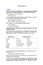
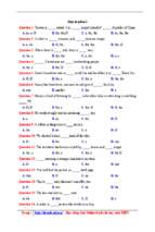
Mô tả:
Nguyen Thuy Mi_07.1.e3_k41
*****************************************************************************
OVERVIEW OF CHARTS
I - INTRODUCTION TO CHARTS:
1. Definition:
A chart is a visual representation of data, in which the data are represented by symbols. A
chart can represent tabular numeric data, functions or some kinds of qualitative structures.
2. Features:
2.1 Title:
Title usually appears above the main graphic and provides a succinct description of what the
data in the graph refers to.
2.2 Data:
The data can appear in all manner of formats, with or without individual labels. It may
appear as dots or shapes, connected or unconnected, and in any combination of colors and patterns.
Inferences or points of interest can be overlayed directly on the graph to further aid information
extraction
2.3 Axis:
A horizontal axis, X-axis, is labeled with the name of a variable and the units represented.
A vertical axis, Y-axis, is labeled with the name of a variable and the units represented.
Each axis will have a scale, denoted by periodic graduations and usually accompanied by
numerical or categorical indications.
Each axis will typically also have a label displayed outside or beside it, briefly describing
the dimension represented.
2.4 Text and numbers with the unit
Texts: show categorical indication, chart’s note or give more information related to the chart.
Numbers: refer to periodic graduations explicitly and clearly.
2.5 Grid: is used to plot points and data
3. Purpose :
Charts are often used to ease understanding of large quantities of data and the relationships
between parts of the data. Charts can usually be read more quickly than the raw data that they are
produced from.
4. Comparison between charts and graphs :
Charts
Graphs
Writing portfolio 35
**************************************************************************
Nguyen Thuy Mi_07.1.e3_k41
*****************************************************************************
Graphs and Charts is the most efficient method for displaying information in a simple manner.
Using this form of representation helps it's viewers to understand and interpret the information more
easily and efficiently, which otherwise could be a very difficult and tedious process.
Charts are usually used to represent simple two Graph is usually referred to be used in some
variable data, such as Bar charts or pie charts. mathematical sense because it usually contains X,
These can also be used to refer quantities that Y or Z-axis. In a graph no data is represented
refer complex data-dense maps.
without using axes and sometimes it is also
divided into grids for easier classification of data.
5. Kinds of charts:
Kinds
Visual aid
Features
Purpose
a type of graph which displays is often used to visualize a
Line
chart
information as a series of data points trend in data over intervals
connected by straight line segments.
of time, thus the line is
often
chronologically.
Writing portfolio 36
**************************************************************************
drawn
Nguyen Thuy Mi_07.1.e3_k41
*****************************************************************************
a chart with rectangular bars with used for comparing two or
lengths proportional to the values that more
Bar
they represent.
values
that
were
taken over time or on
chart
different
conditions,
usually on small data sets.
a circular chart divided into sectors, to compare among parts of
illustrating
Pie chart
relative
magnitudes
frequencies.
or the whole pie, emphasizing
important
pieces
of
relational
data
information.
a simple plan which represents a illustrate
Flow
machine, system or idea, etc., often including
chart/
drawn to explain how it works
structures
organization
and
reporting
hierarchy.
diagram
a set of facts and figures arranged in used to show data values or
columns and rows.
to capture data that is
difficult
Table
to
depict
graphically.
a chart connects various kinds of charts combine many usages and
in the whole chart.
Mixed
purposes of kinds of charts
to illustrate the data more
chart
effectively.
II - Structures to describe a chart:
1. Tense: usually use Present Simple and Past Simple
2. Outline: A paragraph that illustrates charts includes an introductory sentence, body paragraph and
a concluding sentence.
2.1: The introductory sentence shows what you are describing
Eg: The graph shows how the amount of water used worldwide changed between 1900 and 2000.
The given line graph illustrates information on the percentage of people who went to the movies in
the United Kingdom between 1990 and 2010.
Writing portfolio 37
**************************************************************************
Nguyen Thuy Mi_07.1.e3_k41
*****************************************************************************
2.2 Body paragraph
Body graph shows the content of the chart. When discussing the data presented in the chart , identify
significant trends and give examples related to your statement above. If you illustrate a process or a
table, you need to arrange your information in logical order.
Eg: To begin with, molten plastic is poured into three different moulds depending on the colour
required; the colours are red, blue and yellow. Once these clips emerge from the moulds a quality
control machine checks them for strength. Unsatisfactory clips are rejected. In the third stage in the
process the clips are stored by hand into two groups, mixed and single colours. When this stage is
complete the groups are checked a second time to ensure that the colour mixtures are divided
correctly into single colours and mixed colour batches. Finally, the clips are packed and dispatched
to the markets.
3. Concluding sentence:
A concluding sentence comprises any of the statements below:
A summary of the ideas
Significant comments
A potential solution
Future implications
4. Structures:
4.1 Phrases to indicate what is being written about :
The graph/ chart presents data showing….
The graph/chart provides strong evidence that…
The graph/ chart provides strong support for the thesis that..
As the chart/ graph illustrates/ shows…
As we can see from the/ According to the / As is evident from the graph/ chart
4.2 Indicates insufficient evidence
We can draw no conclusion regarding X, Y from the graph/ chart…
No conclusion regarding X,Y can be drawn from the graph/ chart…
The graph/ chart provides inconclusive evidence regarding ….
The graph/ chart neither proves nor refutes the contention that
4.3 Comparative phrases
Slightly
A little
Writing portfolio 38
**************************************************************************
Nguyen Thuy Mi_07.1.e3_k41
*****************************************************************************
Only a bit
Significantly
larger/ smaller / higher/ than
Much
lower
4.4 Correlation
4.4.1 Positive correlation
The number of X and the number of Y are highly correlated.
There is a strong correlation between the number of X and the number of Y.
4.4.2 Negative correlation
X and Y seem to be inversely correlated.
There is an inverse correlation between the number of X and the number of Y .
4.4.3 No correlation
There does not seem to be any correlation/ causal relation between the number of X and the number
of Y
5. Verbs
Up
Climb
Down
Decline
At the bottom At the top
Stability
Reach the top/ Bottom
out Bounce back
Rise
Decrease
peak
Reach
Increase
Drop
Peak
lowest point
Surge
Fall
Hold steady
Rocket
Slide
Level off
Strengthen
Weaken
the Recover
Flatten out
6. Adjectives:
Slow/ Steady/ slight/ sharp/ gradual/ sudden/dramatic
7. Nouns:
Decline/ decrease/ drop/ fall/ rise/improvement
Writing portfolio 39
**************************************************************************
- Xem thêm -